Friday, February 17, 2012

Some of my work

Here is a link to an online portfolio I have put together with some of my work. Enjoy!

IWD Poster Painting Final
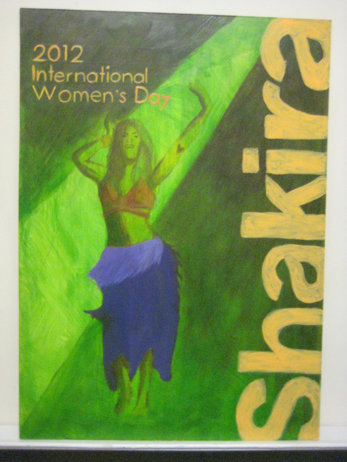
For my title and name I decided to paint them in an orange yellow colour which is still part of the triad colour scheme that I chose for my painting. The name I decided to make it in a big bold type style and bleed it of the side, and the title I made it in a thin type style flushed left. This is my final piece for International Women's Day.

IWD Poster Painting IV

I decided to make the background darker to make more contrast with the spot light. To do this I started painting with purple at the top right corner going diagonal and blending it with the green thats under. I also started making guides for my title and the name of my artist with blue pencil and my next step is to paint them.

Sunday, February 5, 2012

IWD Poster Painting III

Here you can see I added colour to her body and clothing. I use orange and purple which are two complementary colours of the green in the triad colour scheme.

Monday, January 30, 2012

IWD Poster Painting II

The next step is to identify the dark areas of the composition and start painting them. I made a spot light coming from the upper right corner and instead of painting it with a lighter colour, I applied a darker tone around it to make it stand out. Next I found the shadows in her body in reference to the spot light and identified them with the same tone I just used for the background. The result is shown in the picture.

IWD Poster painting


The next step is to prepare the masonite with a coat of gesso and then make a pencil drawing of the
woman. The next step is to start painting the background colour with acrylic. I chose to paint a green background and the result of my paint mix was a lime green look which I was happy with.

IWD Poster colour comps

 The next step in completing my poster is to choose the right colours for the composition and to this I used the website: www.colorschemedesigner.com which is a good reference of colour schemes. I chose to use the Triad colour scheme and thats how I got my combinations in the pictures. For the key colour I tried both warm and cool colours to see some variation and choose the best combination. At the end I decided to go with the green and purple combination.