This is my front cover design for the booklet and I decided to do a fire text technique. Fire is one of my favorite effects that I like to work on and play around with.
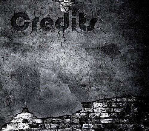
This is my back cover design the booklet and here I used a crack effect. Since I started out with a cracked wall in the front cover, I decided to keep the same look in the back but with a different technique.
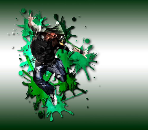
This is the colour box technique from the ones that Phil provided us in class, except that I changed the squares for splashes to make it more interesting and give it a nicer look.
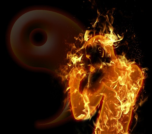
This is another fire technique I putting in my booklet, like I said is one of my favorites. I wanted to do this one because is a person I'm using and I wanted to see if I could actually make a fireman.

Since I had a second fire effect and it happened to be a fighter, I decided to make a fight scene between fire and water. The idea is to make it look as if the bad and good side of the same person were fighting against each other.


No comments:
Post a Comment